Friday, 30 September 2011
Thursday, 29 September 2011
Researching the market place
In todays lesson we researched magazines and had to get images of the magazine the notes had to include:
- The prices
- Freguency of publication
- The issue size
- Regular content
- Feature articles
- The positioning statement
- Website
 |
Price: £3.99 Frequency of publication: 170 Regular content: 'the music that changed my life' Feature: on tour with Coldplay, 200 things you didn’t know about the Beatles and rocks greatest nut jobs Positioning statement: discover great music Website: http://www.qthemusic.com/ |
 | ||
Price: £2.20 Frequency of publication: weekly Regular content: interviews and reviews Feature: preview and plus sections Positioning statement: new musical express Website: www.nme.com
|

http://www.nme.com/mediapack/pdf/nme_media_information_full.pdf
http://www.bauermedia.co.uk/Global/mediapacks/Kerrang.pdf
Wednesday, 28 September 2011
rough layouts


 |
| this is my double page spread i also drew this out so it would be easier and faster to create. |
Initial ideas
in this lesson we discused ideas for our magazine.
Intial Ideas
prices: £2.99
frequency: once a month
regular content: new albums from the latest bands
feature content: interviews
I will produce an indie magazine. This will be for a target audience of 15-20 year olds
genre: indie magazine
Intial Ideas
prices: £2.99
frequency: once a month
regular content: new albums from the latest bands
feature content: interviews
I will produce an indie magazine. This will be for a target audience of 15-20 year olds
genre: indie magazine
Tuesday, 27 September 2011
music magazine contents
In this lesson I analysed my magazine content.
The contents page has a main image that dominates the page to show it is the main article in the magazine the page is set out out in three columns. The masthead contains the title of the magazine this is black and stands out on the light blue background the same with the word contenst the date however is in the same colour as the article information.
 |
Monday, 26 September 2011
school magazine front cover
In this lesson we produced our magazines.
 |
| The main image is a picture of two students one of them holding a book this links to the magazine because a book is apart of school equipment. It is a two shot and they will both be looking directly at the camera to gain attention. You can see in the bottom left corner there is a green circle with text in saying 'FREE!' in big letters this is so the reader attention will be drawn to it they will think they are getting more than what they paid for. The barcode is in the bottom right corner this is so its out the way. On both sides of the pages are text they are not covering the pupils faces so they stand out more they are yellow this also helps them stand out. The mast head contains the price, title, date and positioning statment the title is 'TEXT BOOK' this is because it plays on words the postioning statement is 'The Greatest Text Book' this gives the magazines ethos. |
screen grabs
In this lesson I had make screen grabs of my magazine front cover to show the steps of my production.


I then added in the rest of my cover lines they are a different colour to the rest of the magazine because these are the main stories in the magazine and need to stand out so the reader can decide weather to buy this magazine or not.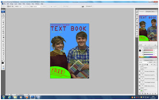
I then started to add text like my positioning statement this gives the magazine an ethos. I also add a cover line and text for my free give away the reader will spot this and it will make them think they are getting something for free.

I then added in the rest of my cover lines they are a different colour to the rest of the magazine because these are the main stories in the magazine and need to stand out so the reader can decide weather to buy this magazine or not.

I then added in the barcode this is out the way in the bottom right corner so the reader does not get distracted by this.
Sunday, 25 September 2011
magazine images
In todays lesson we took pictures for our magazine. These are the final images.
 |
| This will be the main image for my magazine. |
 |
| This will be my main image for my contents. |
 |
| This will be on my front cover. |
 |
| This is will be in the contents. The main image of my double page. |
 |
| This will be in my contents. |
 |
| This will be in my double page spread. |
Saturday, 24 September 2011

Friday, 23 September 2011
planning content
regulars:
School survival
Editors letter
Best voted teachers
Best students from the top schools
New equipment
Features:
An interview with the brains behind harrow
GCSE results
AS and A2 level results
The best schools
Healthy eating campaigns in schools
how to get ahead of the school year
Whats in fashion tips
how can a cake help? cancer cake sales and coffee mornings
Get involved school activities
musical talent where to go if musically gifted
Thursday, 22 September 2011

Wednesday, 21 September 2011
Plans for front cover
The title of my magazine will be called text book the front cover will include a two shot of a female and a male one holding a notepad looking happy because this gives the impression that school is a very good place to be for younger people. It will also include a free sign on it giving away an item or equipment i will have this because the reader then thinks they are getting something for free. The front cover will also include the price and date of my magazine. My magazines front cover will have coverlines and they will be AS and A2 level results and it will also include what school is best and finally it will have the best GSCEs from this year. The main colour for my magazine is going to be light blue because it is bright and will stand out the coverline text will be yellow this will stand out against the background and the people on the front cover. the free circle will be green with red text inside this will stand out alot to the reader and will include the buzz words. the barcode will be in the botttom right corner of my magazine this will mean its out the way of the main magazine. My positioning statement will be in Kristen ITC size 23pt. My title will be OCR A std size 89. The coverlines are lucida bright size 15 pt. The price and date are in Myriad Pro size 17 pt. The free sign is also in lucida bright size 81 and the text below is size 18pt.
Tuesday, 20 September 2011
magazine contents
In todays lesson we talked about the codes and conventions of a music magazine. This is the information I have.
- The main image relates to the main article it is the biggest image on page.
- The layout of the page is in columns.
- It should have should have subheadings
- The top of the page will have the issue number, the date and the website
- The page number is a different colour to the story
- The page has a bold heading with the bigger font
- The title of the feuture is bolder than the information underneath
- The same colour scheme is used
- There is a page number for each article
- A bigger font will be used for a more important story
- The heading contents is at the top of the page
- The issue number, website and the date are on the top of the page.
- The background is plain and the page usually has 2-3 main colours
- the main image dominats the page
- under each image is a small description
- There is a split inbetween each section
- usually there will be an editors letter
- All the less important images will be smaller
examples of contents pages:


Camera shot types.
In the lesson we learnt about different types of camera shots.
- extreme close up is a shot of the face really close to the camera
- meduim long shot will show the person from the knees up
- big close up a big close up shows the face
- long shot a long shot will show the person or object from far away
- close up will show the head
- very long shot is a person far away from the camera
- medium close up will show a person from the chest up
- high angle the camera will be looking down on the person
- low angle the camera will be looking up at the person
- mid shot will be from the waist up
- two shot will have two people in screen
- over the shoulder will view another person from someone elses shoulder
- tilted frame is when the camera is tilted looking at a person
 |
| low angle medium close up |
 |
| high angle |
 |
| a close up of somone in nature |
 |
| an extreme close up of time |
 |
| a close up of someone using there phone |
 |
| long shot |
 |
| long shot conveying isloation |
 |
| a medium close up |
 |
| a close up conveying freindship |
 |
| a mid shot conveying stress |
 |
| a two shot in medium long shot |
 |
| an over the shoulder shot of someone writing |
Monday, 19 September 2011
Codes and conventions of a music magazine
- Plain background if possible to make image standout
- A band will have a long/medium shot
- A single artist will have a mid shot
- The body language must fit the genre
- Simple colours usually three to four
- The mast head will contain the title and the positioning statement this sets out the magazines ethos for example kerrang 'life is loud'
- The title has a unique font that will not be used in the rest of the magazine
- The barcode is genarally in the bottom right corner but can be anywhere else this can contain the issue number, date, price and website
- Buzz words will be used such as plus because this makes the reader think they are getting something for free
- There is usually one main image
- Sometimes subsiduary images which are smaller
- The main image will be a cole up or a mid shot
- The main image will have no text on the face
- Direct address will be used the star will be looking at the camera
- Images are usually relevant to whats in inside
- Colour scheme is consistent
- Usaully simple colours that dont clash
- Colours reinforce the band
- The coverline is in the same style as the font
- The coverline always relates to stories in the magazine
- Coverline relates to magazine genre
- The font of the price is small if it costs more
- A single artist will have a close up but a band will have a medium longshot
- The artists body language must fit the genre of the magazine


Subscribe to:
Posts (Atom)